TIPS FOR LOGO DESIGN / do’s & don’ts
Your Branding starts with the Name and the Logo. This little mark that needs to catch attention of the ideal audience and sets your company or blog or personal brand apart. This post is for designers & non-designers. Here is a list of Do’s & Don’ts of Logo Design:
1. Do understand the brand
Every brand has unique brand attributes and the logo needs to reach a certain target audience. As a designer it helps to create a mood board to collect inspiration and reminders of the brand ideology. A logo needs meaning and purpose. It plays with things we already know. When designing a logo or selecting a logo for yourself focus on the emotion that it evokes. Is it modern, fun, technical, feminine or masculine … ? It should stay true to the brands personality.
2. Stive for being unique
The logo helps to distinguish your company, brand or blog from its competitors. It’s important to be unique and stand out from the rest. There are so many logos created every day it sure is a challenge to be distinctive. With that in mind, a logo shouldn’t be too busy. Simple is best. Do get inspired by what has already been done before, but make sure to create something that’s just as creative, unique and distinct. Think creatively and create a one-of-a-kind logo.
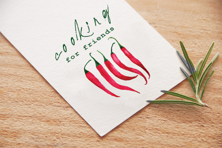
Make it personal: You like red peppers then why not use them in your logo? – Cooking for friends
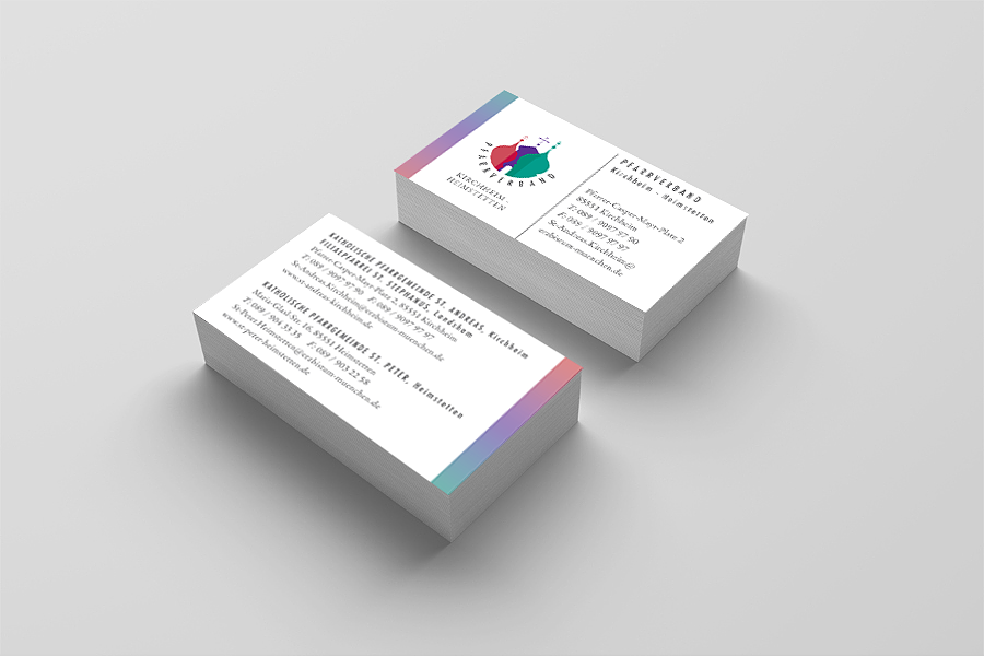
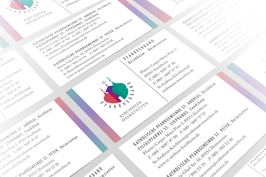
3. Create variations, alternate logos and sub-logos
The logo will most likely be used in a number of different places, whether it’s in the header of a website or the back of a business card. It’s helpful to have variety and versatility when you’re creating a logo for a business or blog. Create a couple compositional variations or create a main logo and a sub-logo to create a hierarchy. Be sure to maintain the same consistency and proportions throughout all variations.
 Since each parish is also operating alone under it’s own name
the client and I decided to create 3 sub-logos, one for each church.
In the sub-logo the other two churches are still visible but they are in the background.
– Pfarrverband / Parish Association
4. Don’t use too many words.
Wordiness doesn’t work. Logo’s should be memorable and simple. To create a logo people will remember it needs to be simplified. Focus on the logo, the icon and separate the company name from the logo. To ensure your logo achieves minimalism start by designing it in black and white. This high contrast allows you to ensure all aspects of the logo are clear.
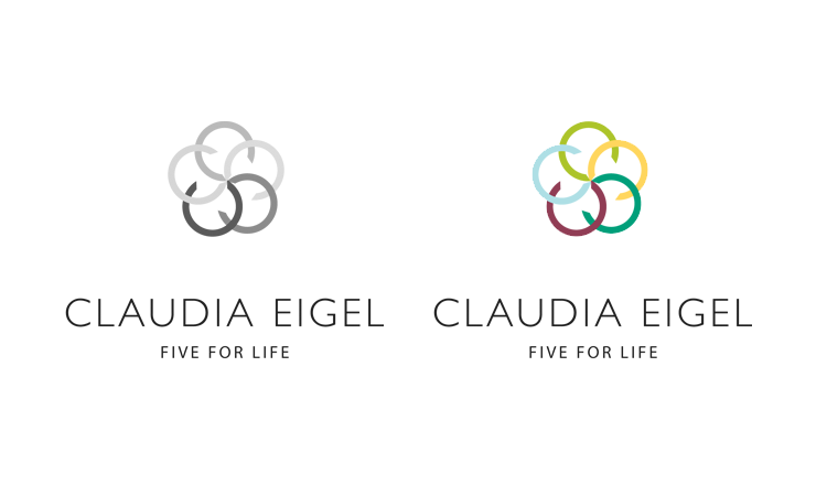
Claudia Eigel – FIVE FOR LIFE: the logo in black & white and grey and next to it in color.
5. Don’t change the design of your logo on a regular basis.
I know this is hard, especially for designers. We get bored easily and have so many more ideas and inspirations. Why not change the logo again and again? But your logo needs time. Time to get recognised and remembered. Sure you see it all the time but your target audience might see it for the first time or has not seen it for a while. You want them to remember it. Don’t confuse them. Keep your logo consistent and constantly the same.
6. And one more do: Do get feedback from others
It can be easy to get tunnel vision when you’ve been developing a logo concept. It really helps to take a step back and ask for feedback. It is hard to be objective when you spend so much effort and time on a project. Never ignore the feedback. Instead listen carefully what people tell you, value their opinion. It can really help your process and the outcome of the design.
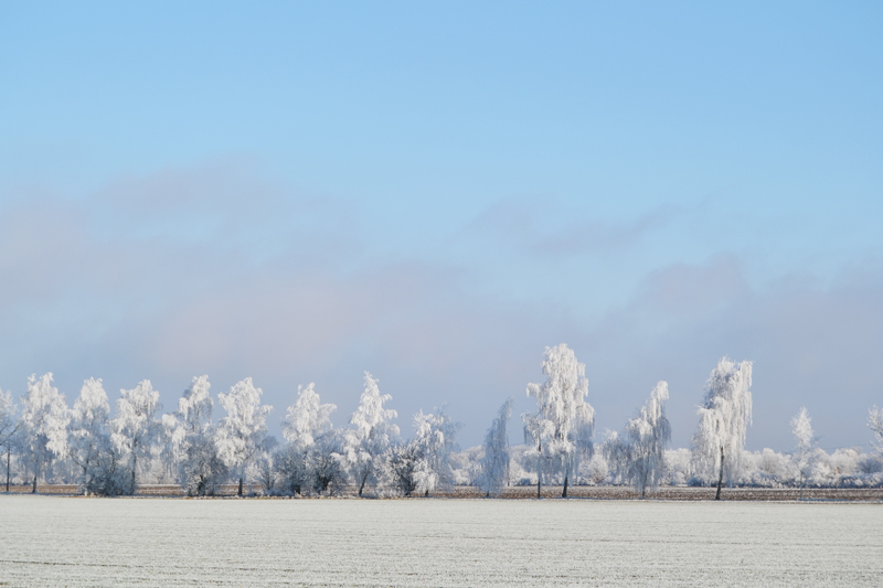
a walk in winter wonderland
Here are some impressions from the walk I took in the frozen and very quiet landscape yesterday.
Every time I’m in nature I’m fascinated by it and so inspired.
Mother nature is the best designer. There is so much beauty and magic and wonder.
Just as Ansel Adams said:
“I believe the world is incomprehensibly beautiful — an endless prospect of magic and wonder.”
With each New Year we get a fresh, clean page to start over.
Here’s hoping that life writes a beautiful new chapter for you this year.
Happy New Year!


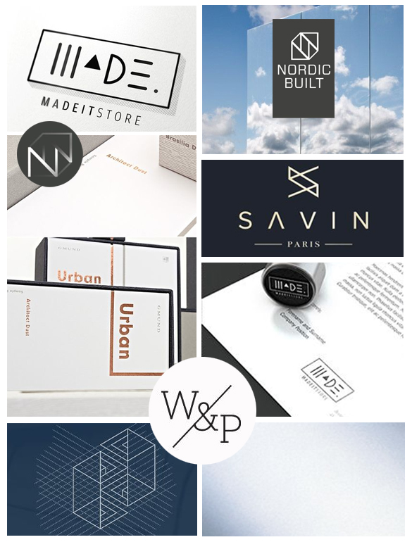
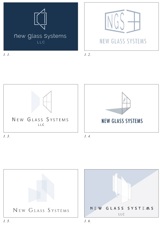
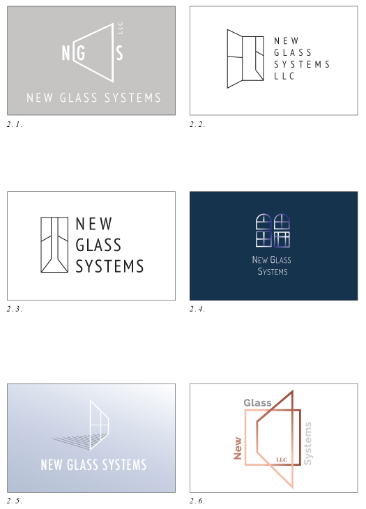
New Glass Systems – work in progress
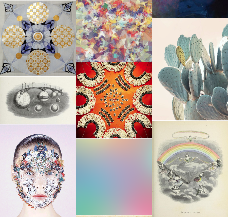
It’s always so exciting to share some work in progress with you for a new brand identity. This Logo is going to be for a window company in Miami. Here you see the moodboard which I pull together from different images from my Pinterest galleries as a research. The board is my starting point when I’m beginning to sketch and put ideas together in illustrator. I then develop 2-3 series of logo concepts. We wanted a clean, modern look. I choose the color palette and fonts. And then it’s off to the client for feedback. I love to develop logo ideas, it’s so interesting to dive into new businesses and industries I haven’t worked in before.
Trust the timing of your life.
Sometimes I think I think to much…
But I’m “… in the right place at the right time doing the right thing.”
Quote by Louise L. Hay
my artwork
Thank you Emma Cassi for sharing my artwork on your tumblr page.
I love your work and this page is so inspiring. So happy to see my work next to so many amazing images!
Find Emma’s beautiful handmade lace jewelry here
My artwork:
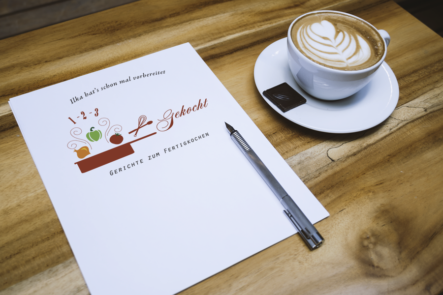
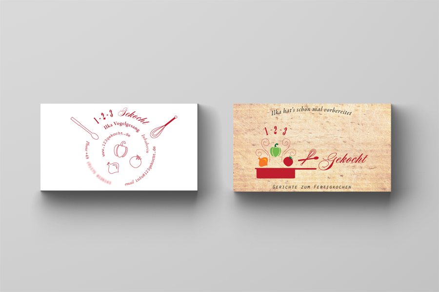
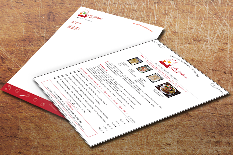
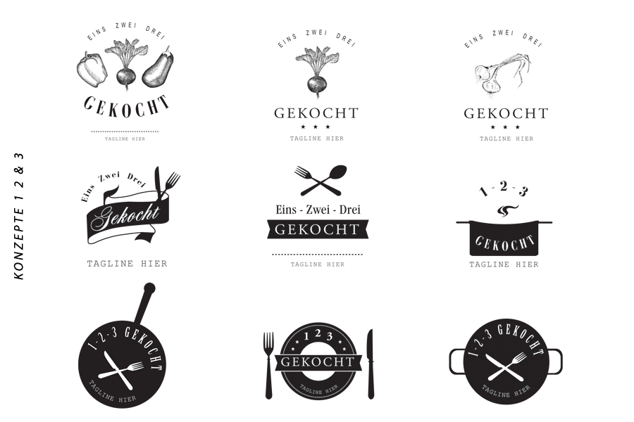
1 2 3 – Cooked – a logo concept
1 2 3 – Gekocht (1 2 3 – Cooked) – the idea – provide the recipe and the ingredients, instead of shopping and preparing yourself. 1 2 3 – Gekocht plans the meals, buys the ingredients in your area, and sends them already cut and prepared along with the cooking instructions directly to your house. It couldn’t be more comfortable. Here the ingredients are not only delivered, but even pre-cut, just mix, cook, fry or boil – and this delicious food is ready to eat.
From SteffiK 1 2 3 – Gekocht got a logo, business cards, a letterhead, the design of the packaging and its menu.
Well then, Bon appetit!

Here are the logo ideas of the first 3 concepts. It’s always so interesting where things had started and how the design developed from there:
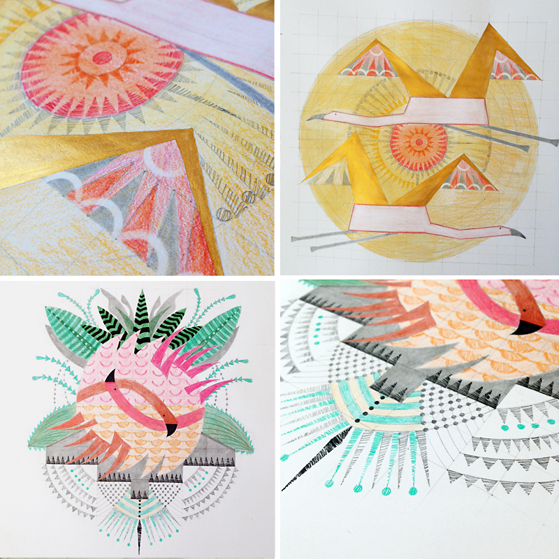
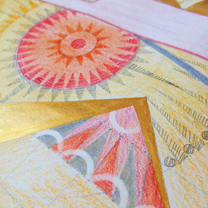
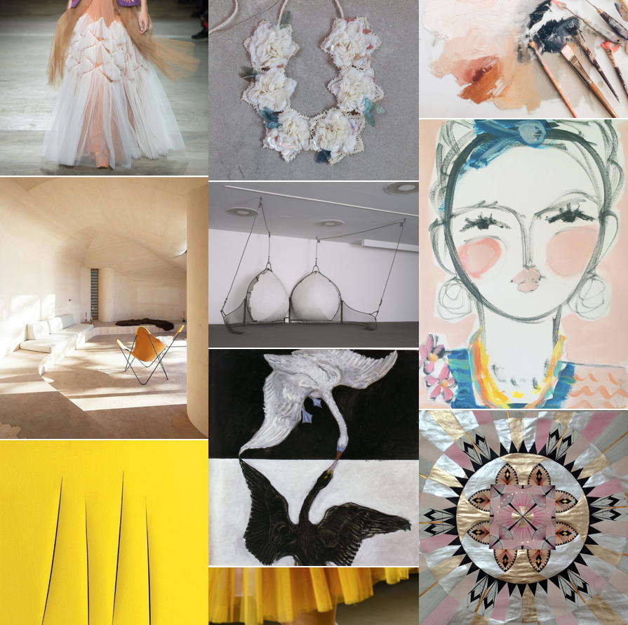
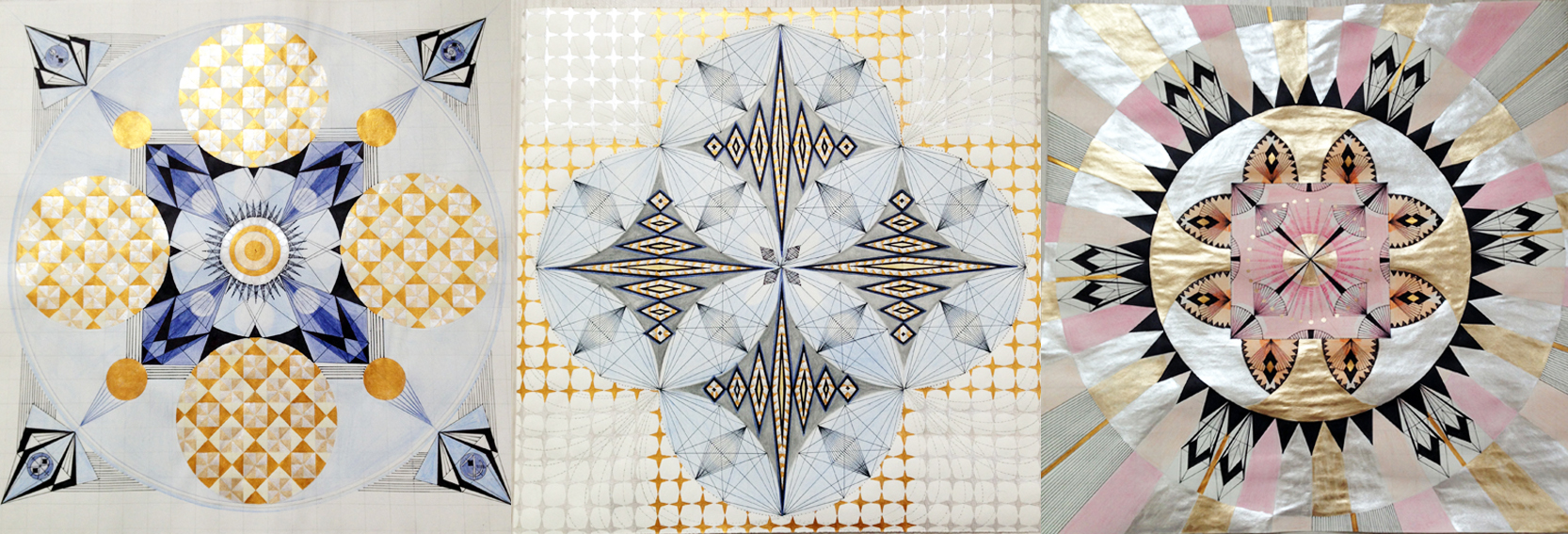
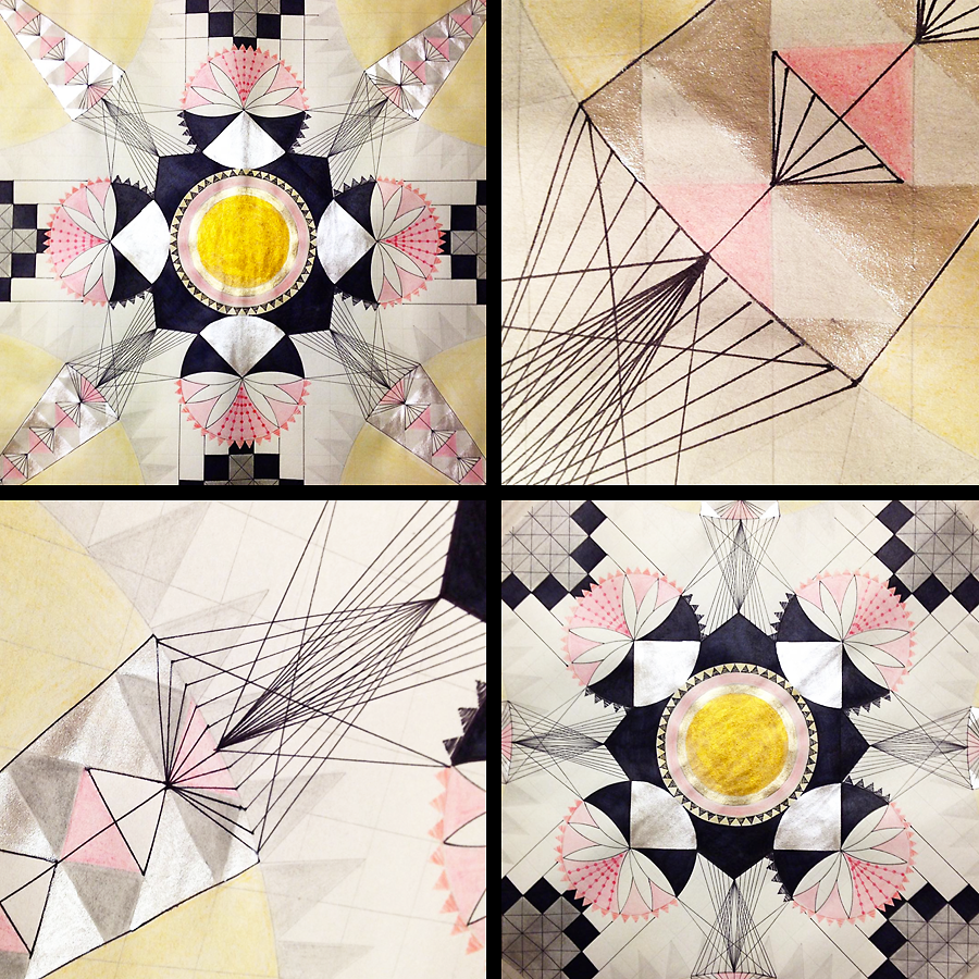
in my studio
Here are some detail shots of #6 of 9 square drawings. 9 of them will form one big square when finished. My tools are stencils, rulers and circles and I concentrate on geometric forms & symmetry. I also use metallic paints to add some sparkle, some reflexion of the light. Making progress and now off to work on #7
new in the portfolio
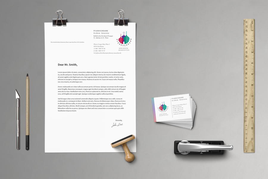
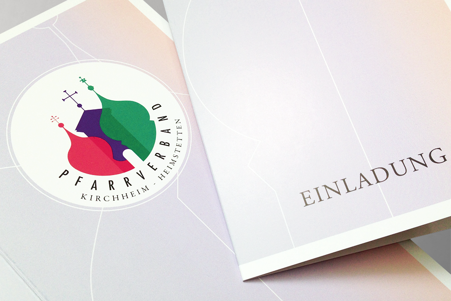
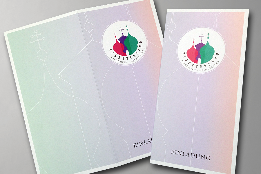
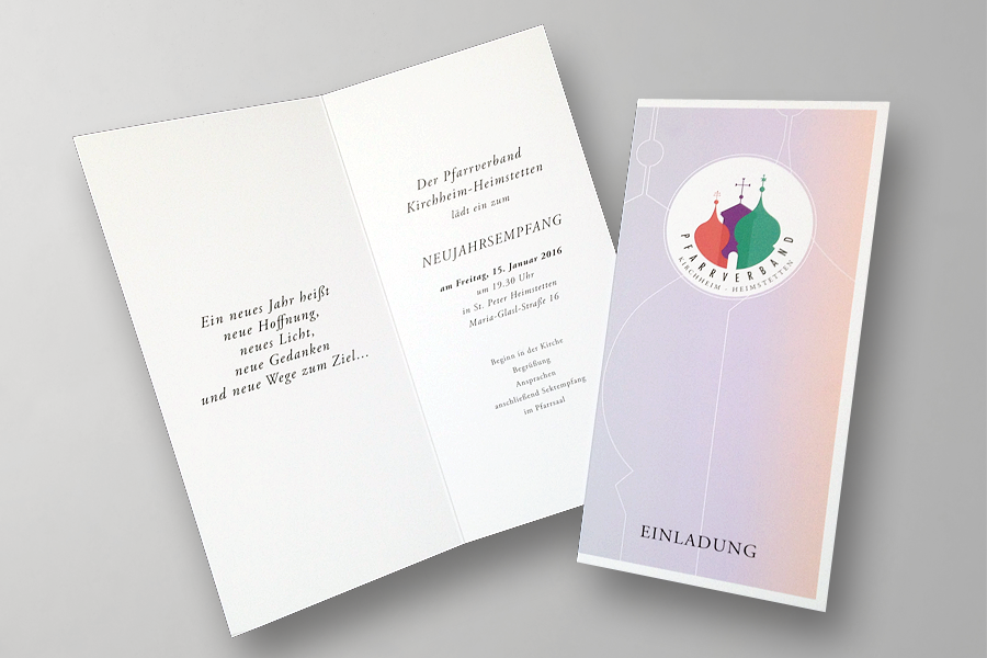
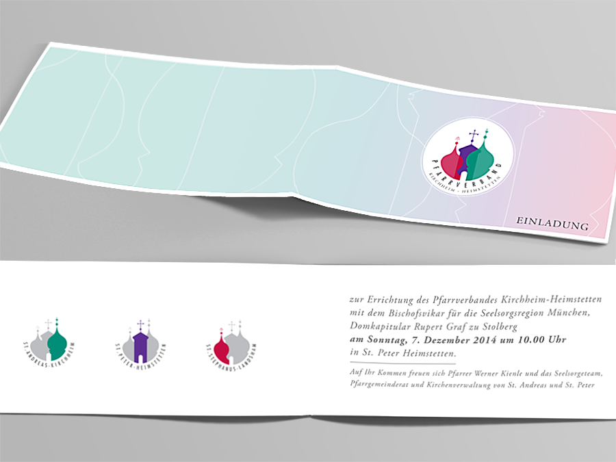
Pfarrverband / Parish Association Kirchheim – Heimstetten
Brand Identity Design / Logo Design / Stationary Design / Invitations
For a long time I’ve been meaning to post this brand design!
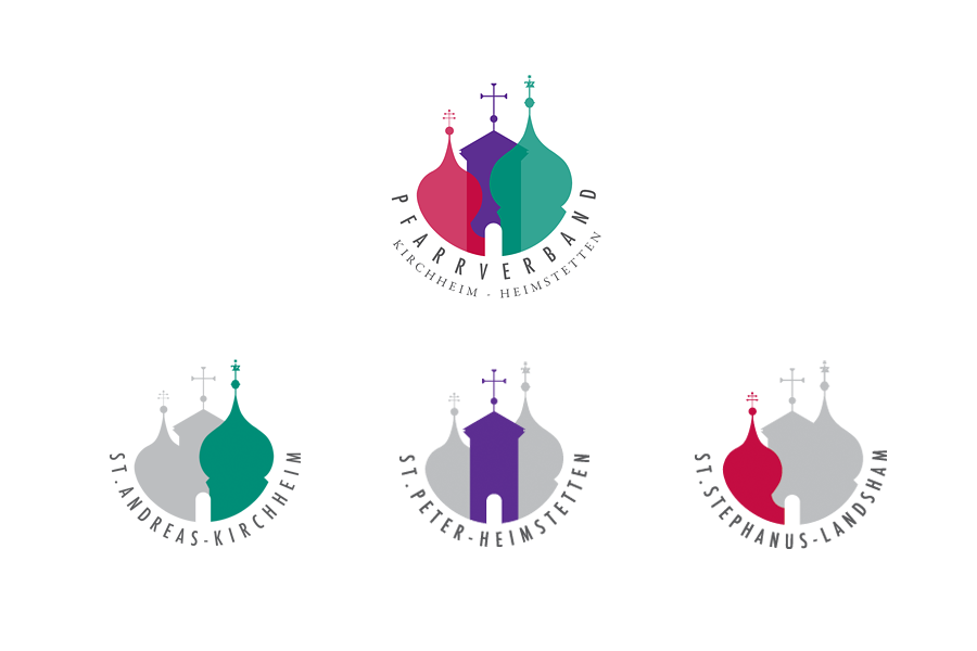
The primary logo of the parish association reflects the new unity of the 3 churches of Kirchheim, Heimstetten and Landsham. I used a circle that is open at the top and in it I brought together the 3 church steeples. Each unique steeple has a a different color and they are slightly overlapping each other. Even though the 3 churches are now one union the different colors express the autonomy of each parish. For each parish I selected a strong, traditional color: Red stands for St. Stephanus in Landsham, purple for St. Peter in Heimstetten and green for St. Andreas in Kirchheim. The typefaces are a combination of both modern and traditional styles.
The logo is like a puzzle, one part can not exist without the other. The open door symbolically represents openness, an invitation to the Community and sociability.
Since each parish is also operating alone under it’s own name we decided to create 3 sub-logos, one for each church. In the sub-logo the other two churches are still visible but they are in the background.
This project was a challenge that I happily took on and I love how it turned out.
See more projects in my portfolio here