new in the portfolio
Pfarrverband / Parish Association Kirchheim – Heimstetten
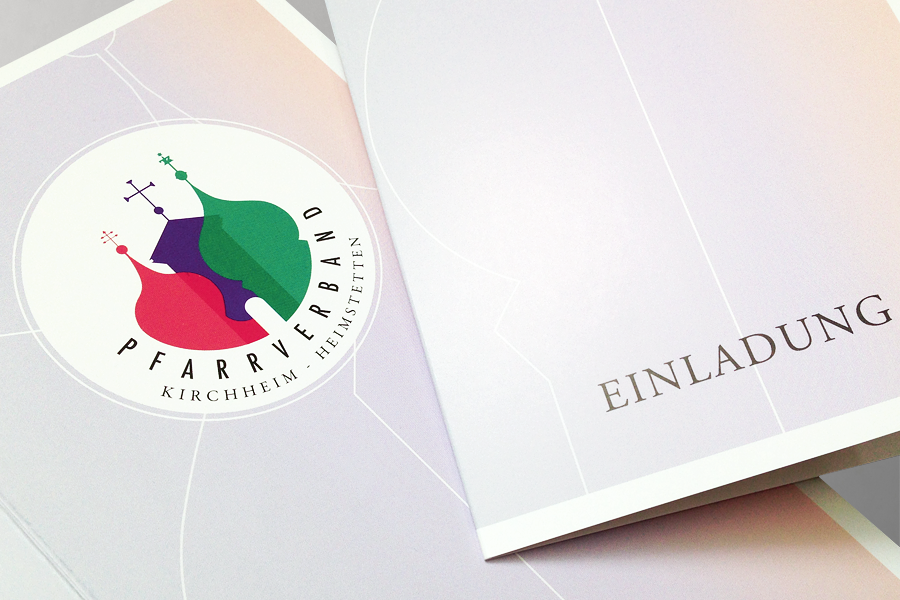
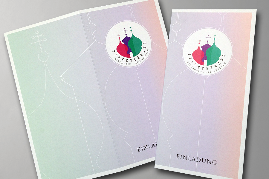
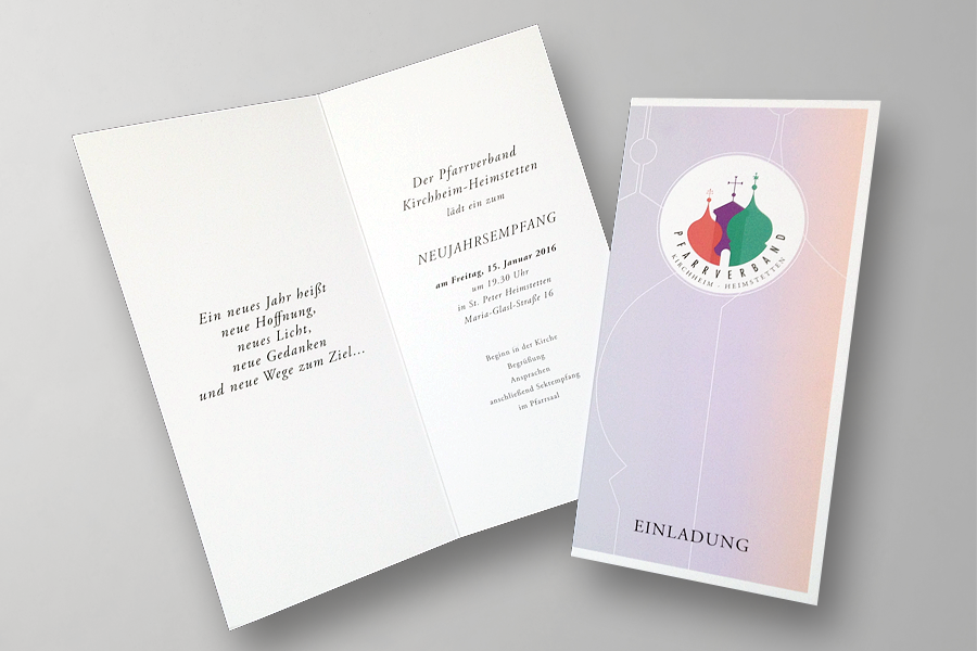
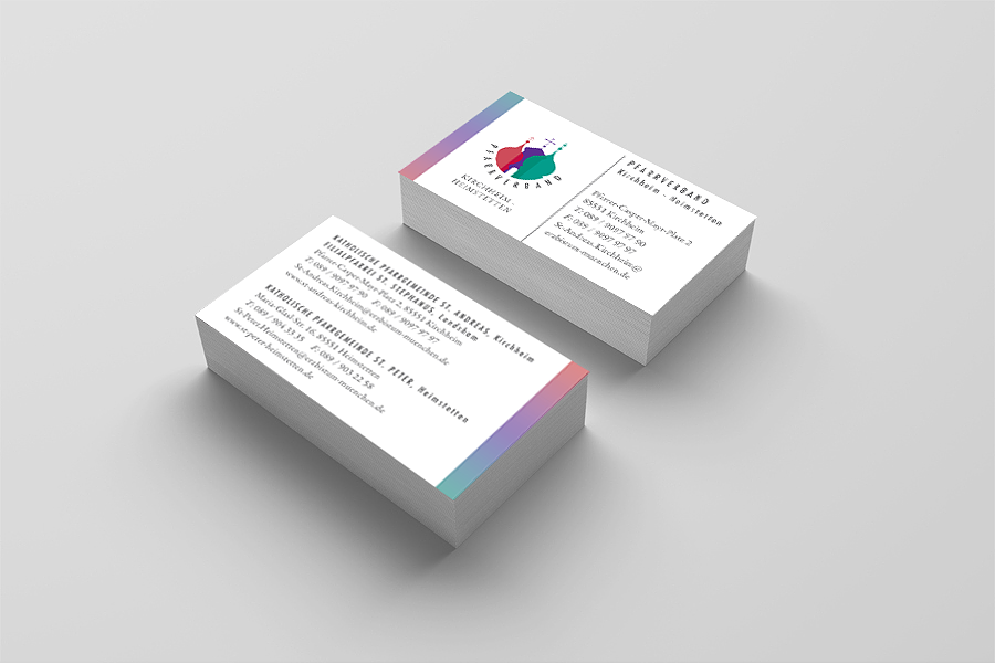
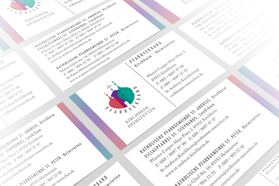
Brand Identity Design / Logo Design / Stationary Design / Invitations
For a long time I’ve been meaning to post this brand design!
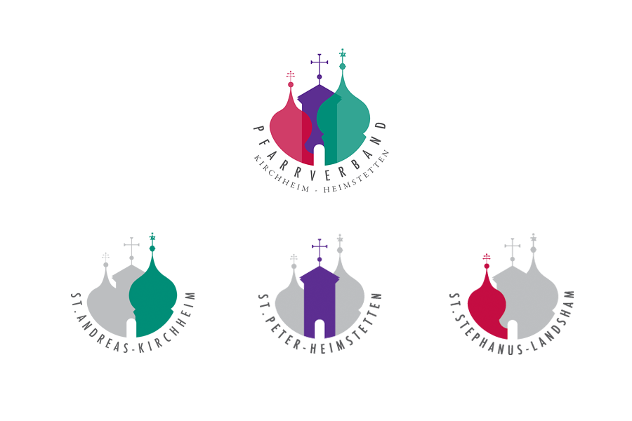
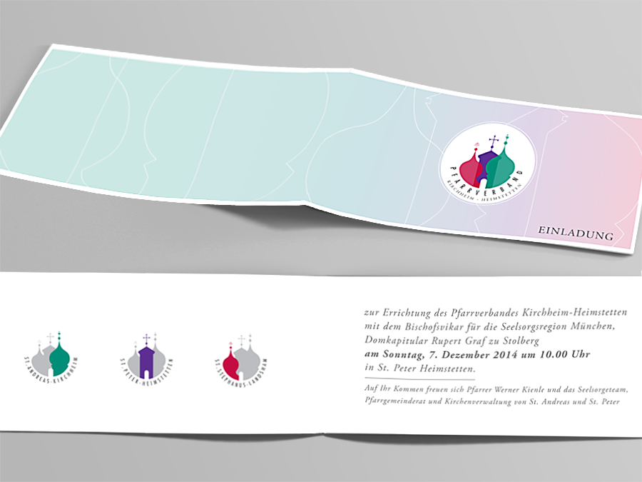
The primary logo of the parish association reflects the new unity of the 3 churches of Kirchheim, Heimstetten and Landsham. I used a circle that is open at the top and in it I brought together the 3 church steeples. Each unique steeple has a a different color and they are slightly overlapping each other. Even though the 3 churches are now one union the different colors express the autonomy of each parish. For each parish I selected a strong, traditional color: Red stands for St. Stephanus in Landsham, purple for St. Peter in Heimstetten and green for St. Andreas in Kirchheim. The typefaces are a combination of both modern and traditional styles.
The logo is like a puzzle, one part can not exist without the other. The open door symbolically represents openness, an invitation to the Community and sociability.
Since each parish is also operating alone under it’s own name we decided to create 3 sub-logos, one for each church. In the sub-logo the other two churches are still visible but they are in the background.
This project was a challenge that I happily took on and I love how it turned out.
See more projects in my portfolio here

